The Autoharp - Zine
A small book about the autoharp, a little known folk instrument, a publication design excercize.
Gallery


Description
This is a book that I’ve been wanting to design for a long time, and I got the chance to make it for a class last year. It focuses on an instrument that I really love, and includes content about the instrument from many people I look up to.
This project was the most intense research effort that I have ever made for a project, because there is a marked lack of historical resources on the topic that are available digitally. I had to do a lot of online sleuthing, and take advantage of the vast collection of books and media that UCLA has access to.
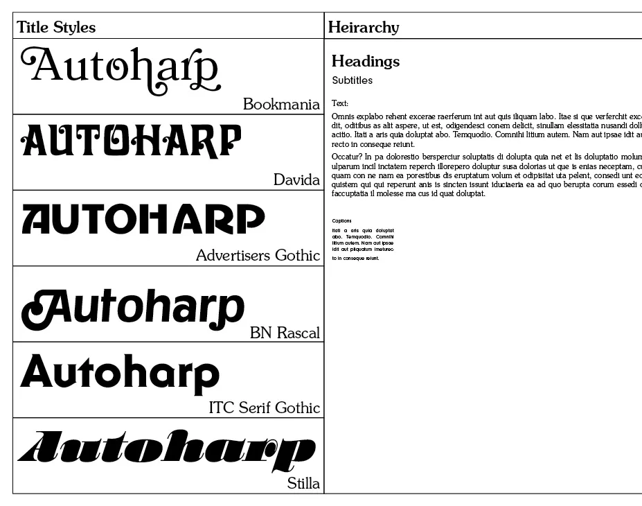
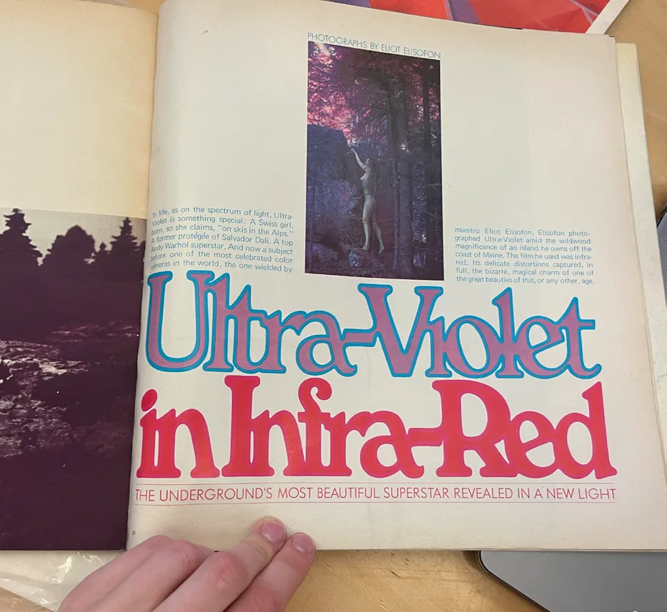
The autoharp had its heyday in the 1970s, when it was adopted by many popular folk and country rock artists like The Lovin Spoonful, Janis Joplin, and Dolly Parton. In context of this, I wanted to design the book with the same visual exuberance that so much of 70s design is characterized by. I was inspired by the work of Ed Benguiat and Herb Lubalin, by the varied typography of publications like Avant Garde Magazine, by colorful illustrations by Milton Glaser, and so much more. These are the reasons why I chose to set the text in ITC Souvenir, and the titles in a lively group of display fonts, like Bookmania, Stilla, and Advertisers Gothic, the popularity of which originates around the time I was interested in.