Perspectives
A type design project exploring the potential for type to communicate about the perspectives behind text
Gallery


Description
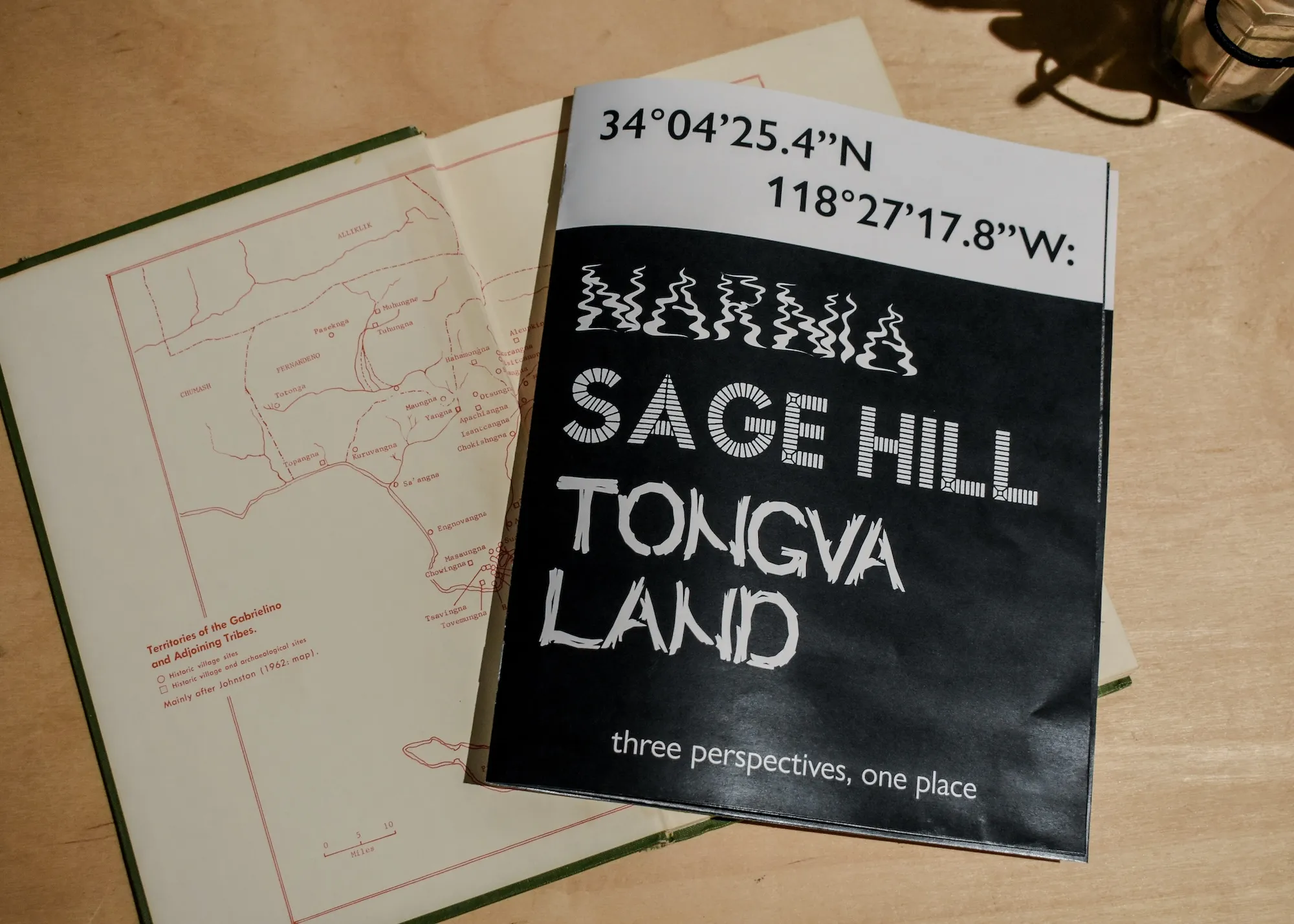
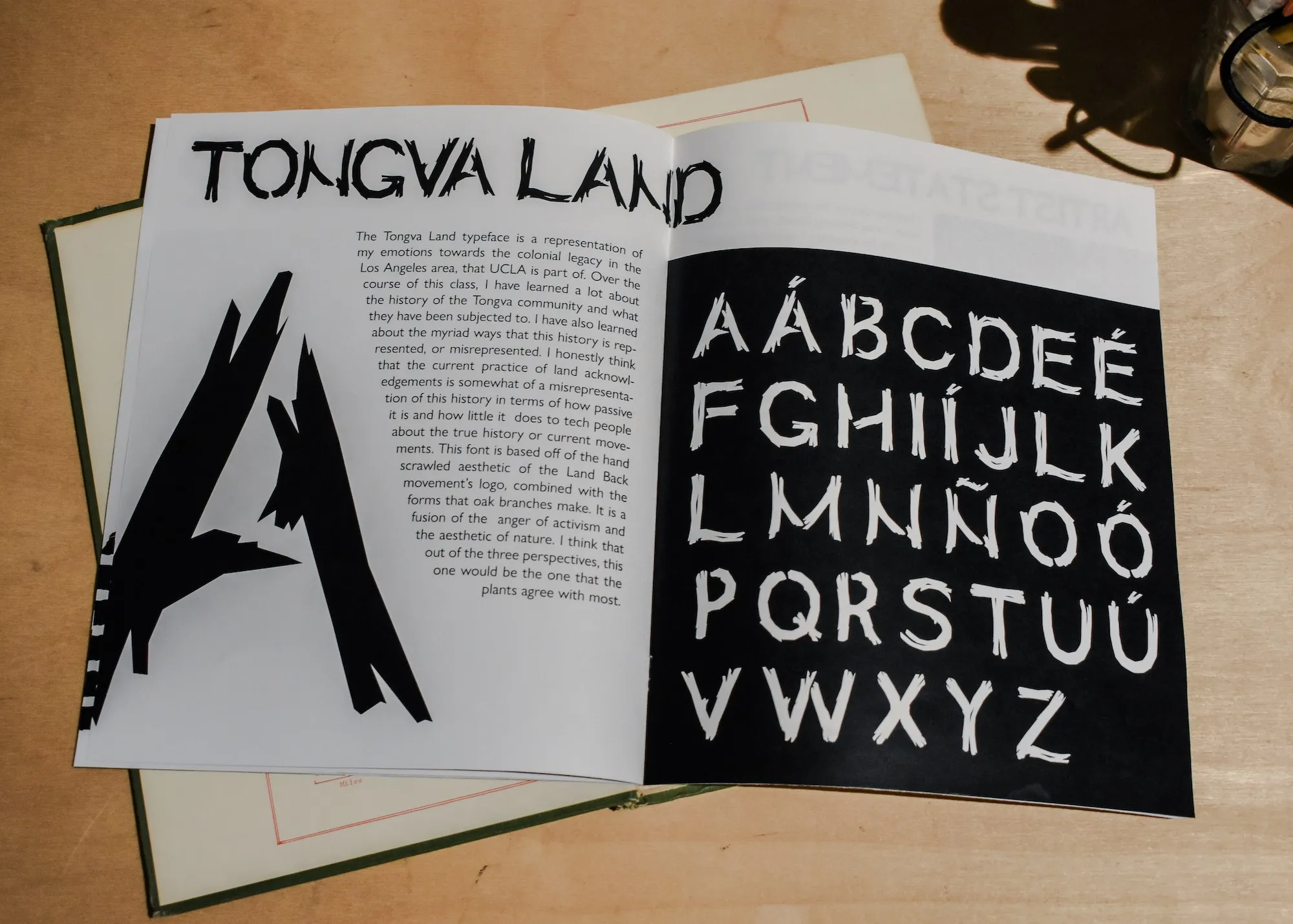
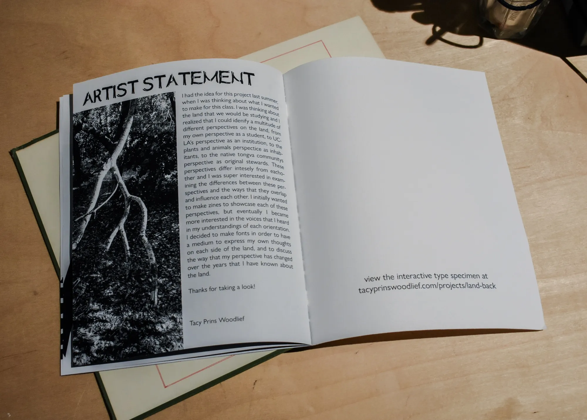
Perspectives is a collection of three fonts that aim to represent three perspectives on a specific piece of land. This land, known as Narnia, Sage Hill, or Tongva Land, depending on what perspective one is operating from, is located on the far western side of UCLA campus, past the dorms. My relationship with this place spans the duration of my undergraduate studies, but my perspective changed over time as I was exposed to different ways of thinking. I used these changes in my views along with research on the background of the land to inform the visual motifs used in each of the fonts. Ultimately, this piece examines the potential of type to use visual references in order to make clear the perspective behind the text that it renders. Can one portray history, motivation, or bias in the form that letters take?
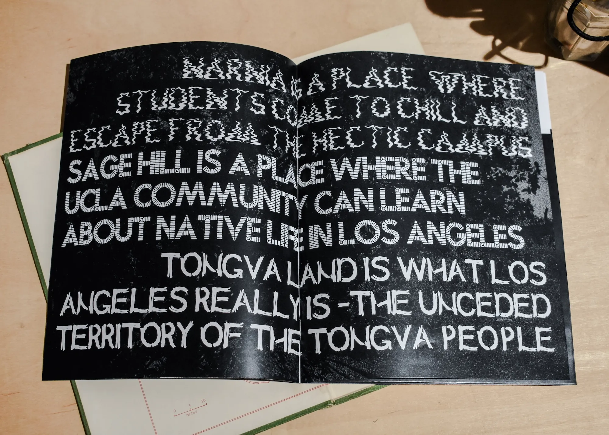
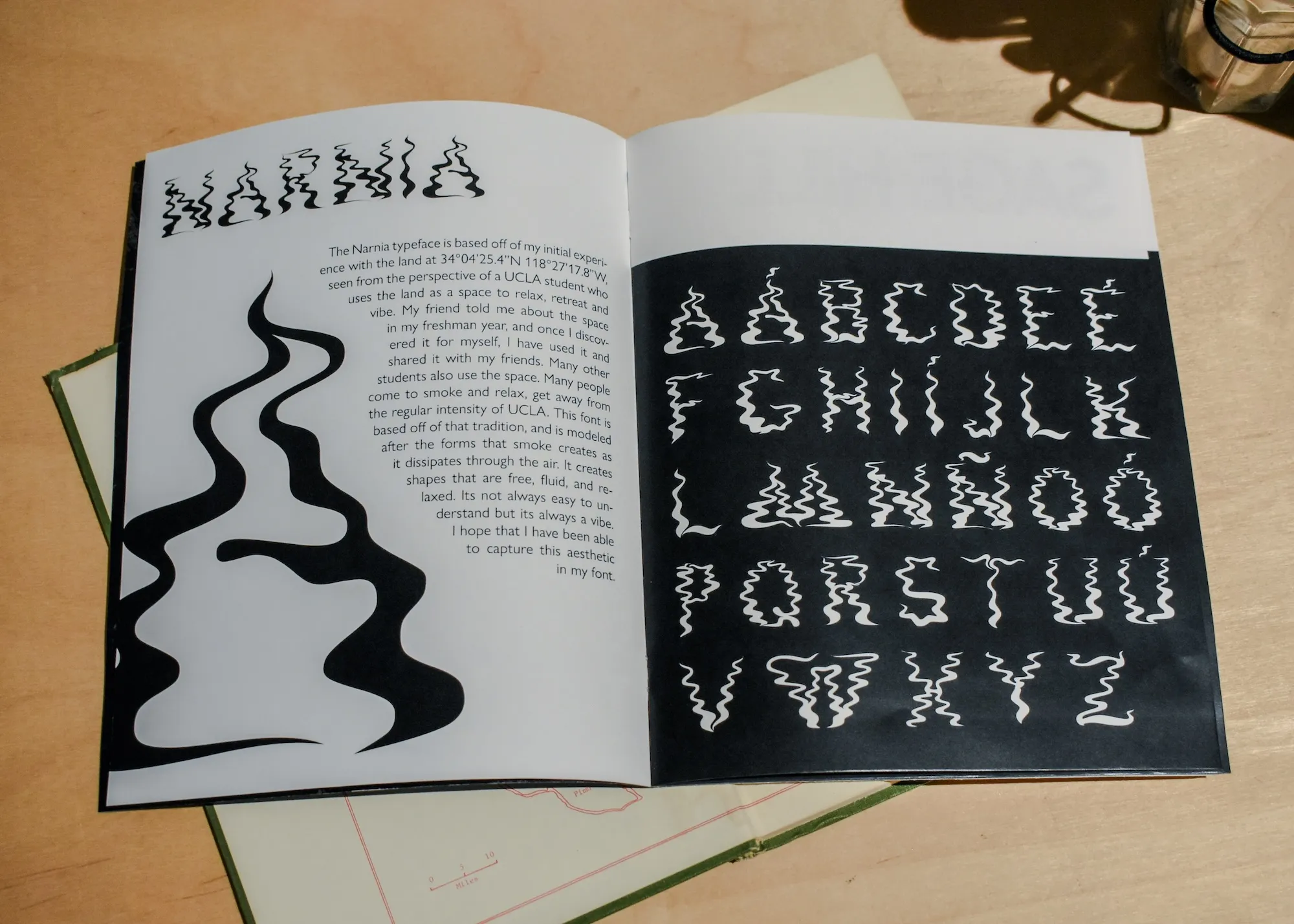
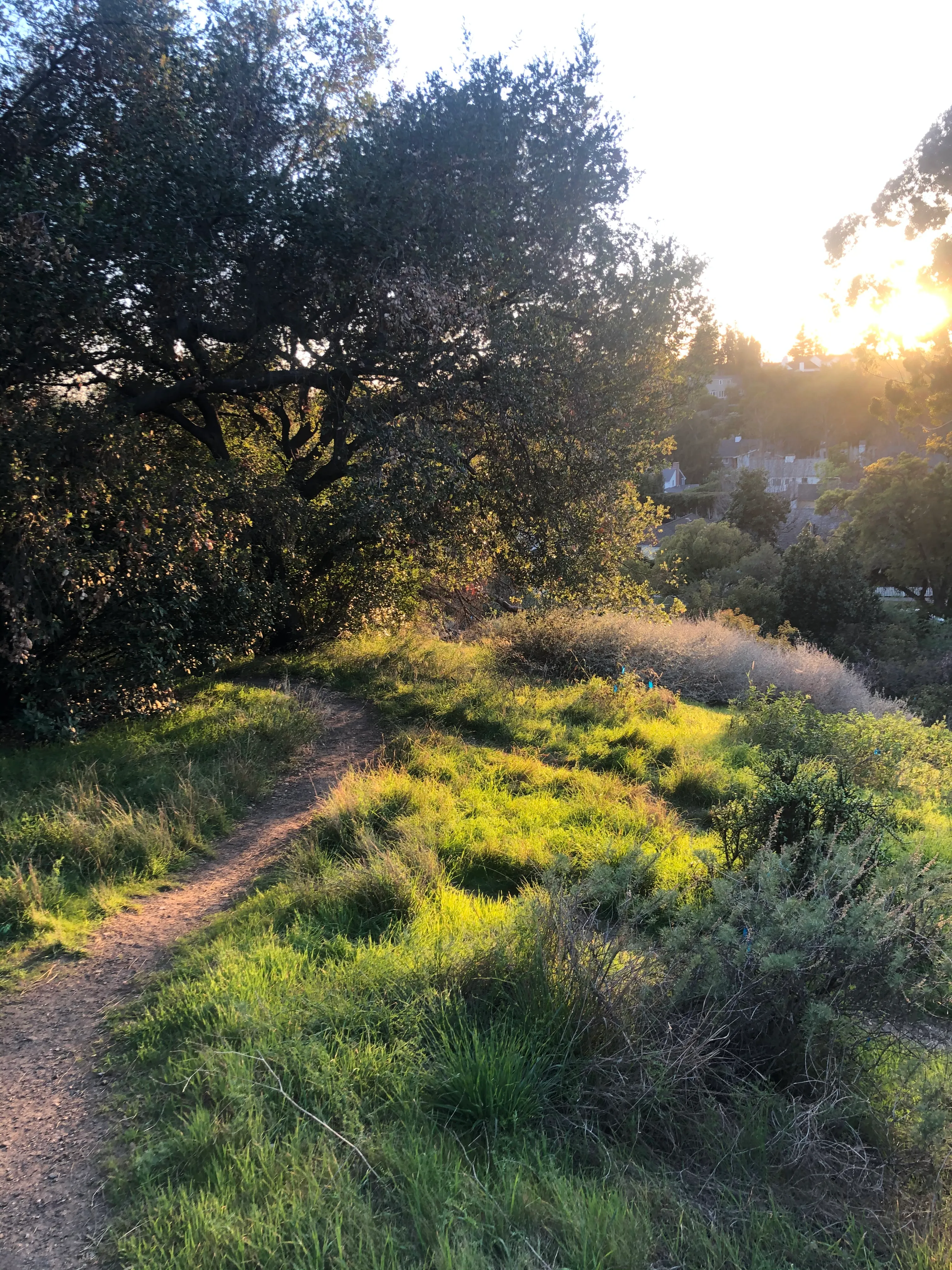
The first experience I had with the land was from my perspective as a UCLA student. To students, this place is known as narnia, and it serves as a spot to hang out and smoke at night, away from the bustle of the dorms. The font for this perspective is composed of wisps of smoke, which also represent the short lived way that students inhabit a university campus.
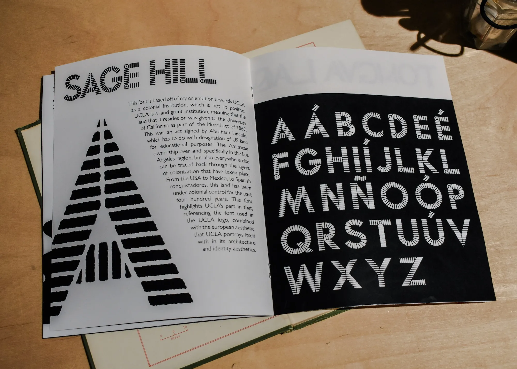
At some point, I learned that UCLA officially calls this place ‘Sage Hill,’ and they use it as a place to research the native ecology, as this is one of the few undeveloped corners of West LA. There’s a certain irony in this, because UCLA, being a land grant institution, is the direct descendant of the colonial powers that have controlled this land since the Spanish invasion. Because of this history, the font for this perspective is composed of patterns of brick, much like the pavestones found all across campus, representing the control the university exerts over this land.
Every class at UCLA is required to have a section in its syllabus acknowledging that the campus is unceded Tongva (or Gabrieleño) land. These are passive recognitions of the third perspective, that of the Tongva community, and they don’t have much impact because there is rarely any effort to teach more of the history. I did my own research into this history, and the font representing this perspective is called Tovaangar, the Tongva word for their ancestral land. This perspective is not ephemeral, like that of students, and it is rooted in a deep history of caring for the land, so the shapes of the letters are formed by the shapes of tree branches.
The photos on this page show an installation of this work that I made for my programs 2023 undergraduate exhibition. The focus of the installation is a web piece that I made, using the typefaces to tell the story of how my perspective changed over time. Most typefaces are unconcerned with the content of the text they are used to render, or who it was that wrote it. These typefaces are different. They take an active role in adding meaning to the text, as a tool to make the speaker’s bias clearer, by analogy with motifs representing each perspective. Normal typefaces can have this effect too, albeit in a much less visible way; When typographical motifs become typical of social or political groups, they can function as metonyms, affecting the connotations we perceive.