TPW Corral
A western style typeface for wrangling small text, made in the letterform archive’s Intro to Modern Type Design program.
Gallery


Description
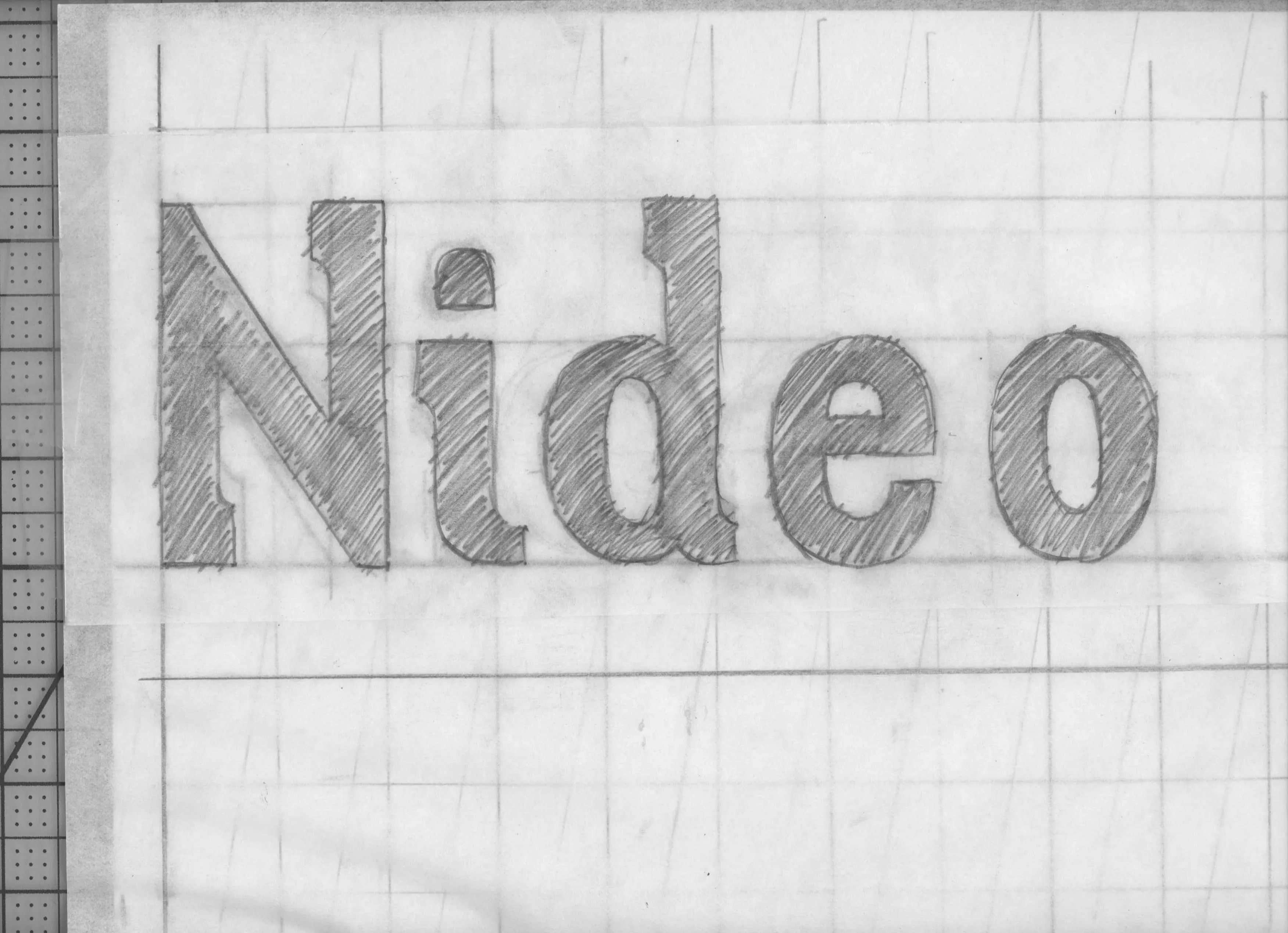
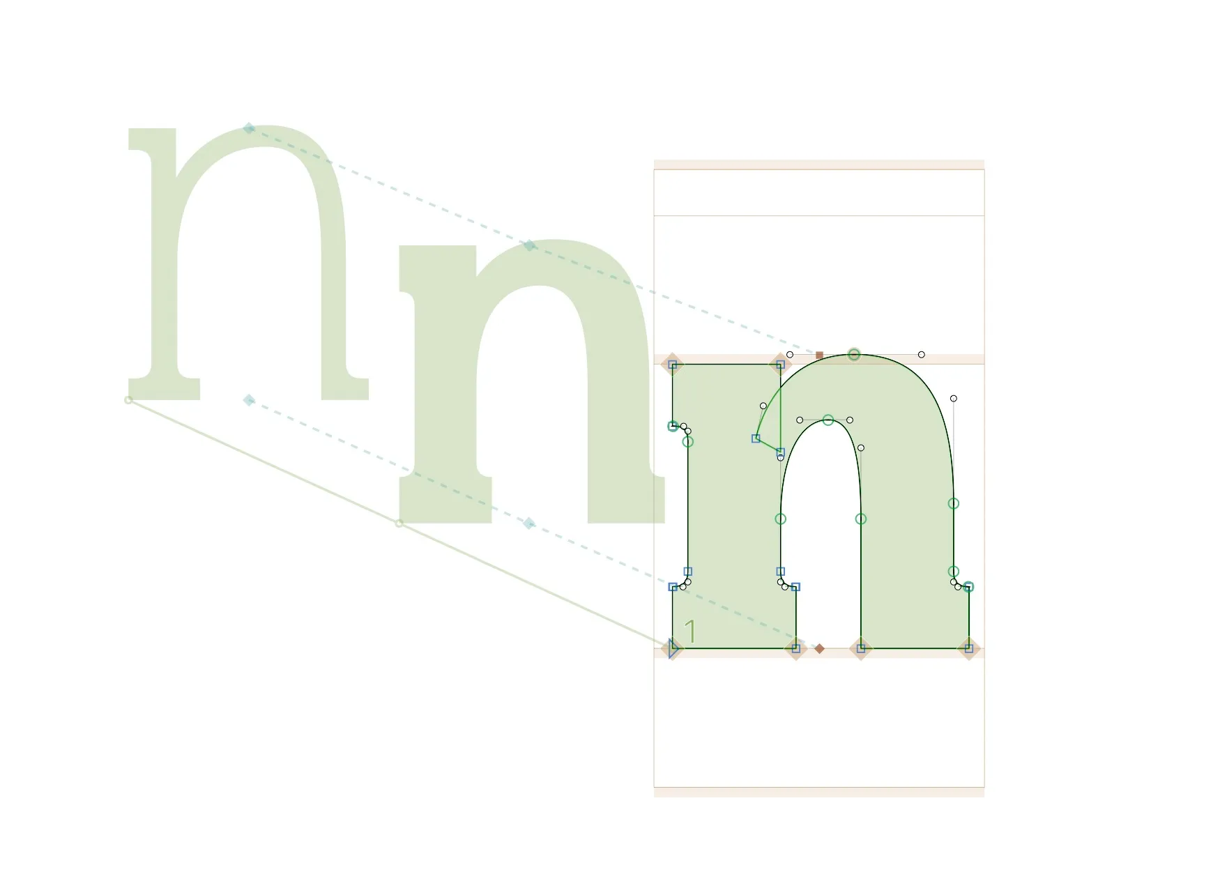
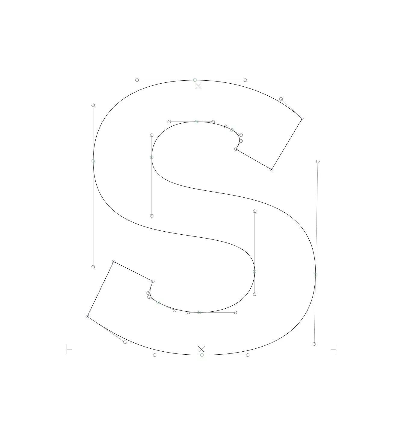
This is a typeface that I made for Letterform Archive’s Intro to Modern Type Design program during the summer of 2023. My goal for the project wasto make a typeface with a classic western feel, but that could work at text sizes, as well as display sizes. The typeface still needs refining, but I’m really proud of what I was able to accomplish solely during the ten-week class. In the future, I plan to refine the proportions a bit and work on production tasks such as kerning and hinting. I also planto add weights, and create a full variable font.
I learned an incredible amount in the short time that I spent taking this class. I had made typefaces before, but my learning had been completely self directed. During this class, I learned strategies for type design ideation, sketching and system design, among many others. I refined my vector editing skills to a completely new place and gained a proficiency with type design concepts and real life applications in Glyphs that I am really proud of.