Sassafras Therapy Brand Identity
A brand identity that I designed for a therapist I know, using clean colors and graphics to create an approachable vibe.
Gallery


Description
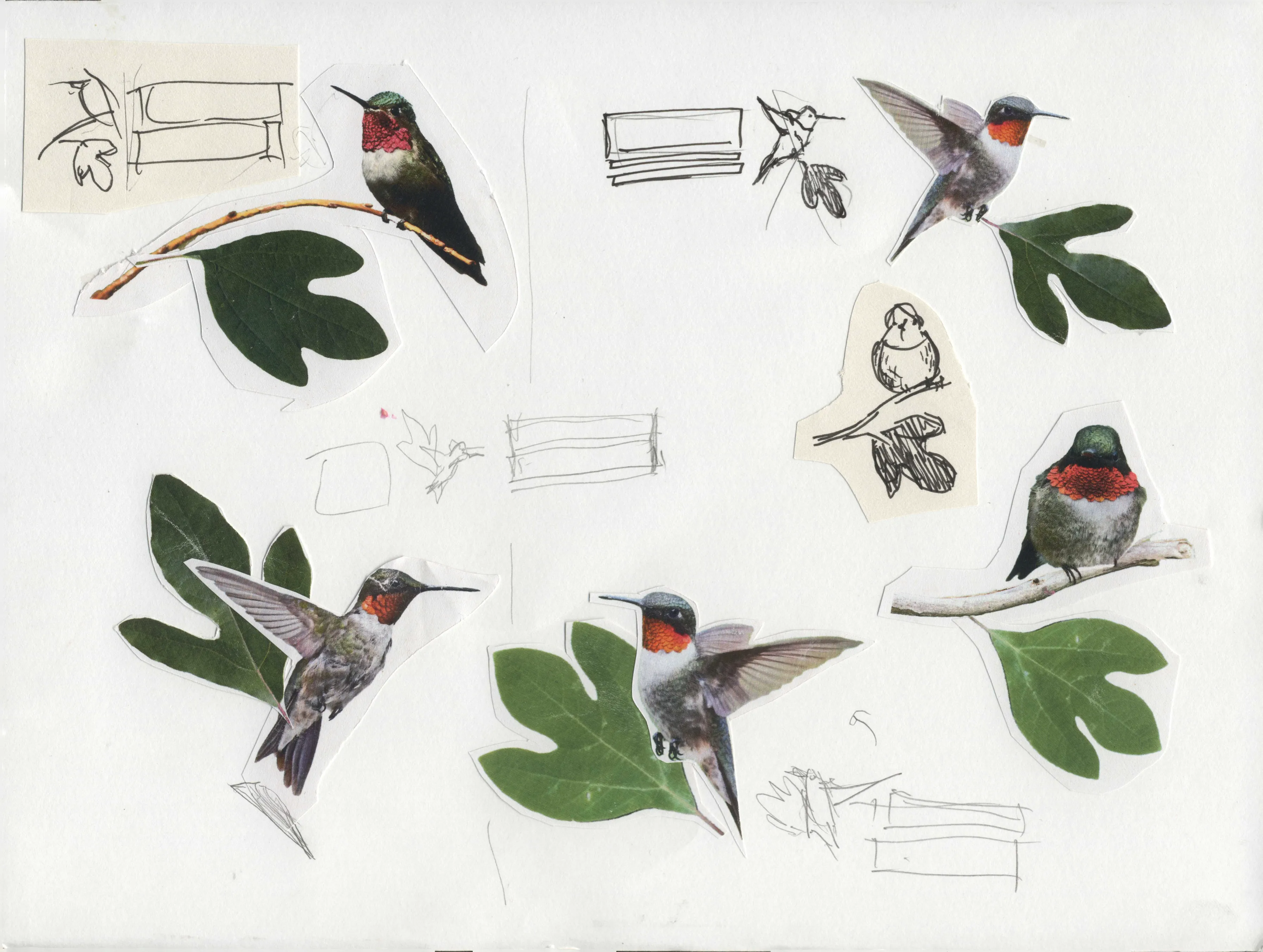
This is a brand identity project that I did for a therapist opening her own private practice. She came to me with the idea of including a sassafras leaf and a hummingbird in the logo, and while I was initially a bit concerned that the resulting logo would be too busy, I believe that I found an effective way of organizing the elements into a small pictorial logo mark. I chose to use a low poly vector drawing style, and bright friendly colors, to make the logo look quirky and approachable, and extend that vibe to the brand as well.
For the logotype, I elected to use a font from google fonts so that my client would not have to deal with licensing. I chose Noto Serif for its soft aesthetic, and tall x-height, which works well in the lock-up layout that I wanted for the logo.